Paper Prototypes
Our initial paper prototyping designs were fairly rudimentary, but they served as a valuable way of getting ideas onto, literal, paper and to toy around with basic UI layouts and designs. Through these paper prototypes, we refined the look we wanted to settle with and iterated upon them as a group. By combining both of our works and improving on the design we were able to come to a conclusion on a style of layout that we liked and thought would fit with the project.
First Iteration
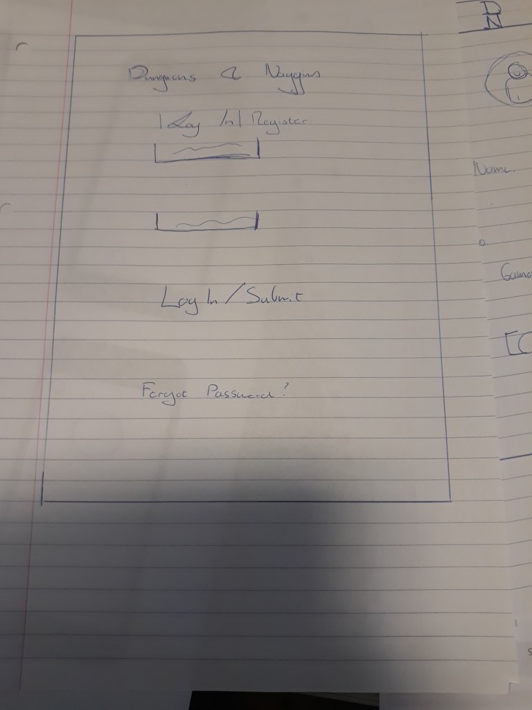
Our first prototypes mainly consisted of the process of logging in to the application and being brought to the initial map menu that would compose the majority of the user’s first screen. When brought to other users for testing, they found the process simple to follow and understand. This satisfied our requirement of it being easy to use and require very little learning to properly utilize. Feedback was given for how we could implement a larger view of a selected bar and potentially a user profile function. These were taken into consideration for our next prototype, and then the combined prototype.
Second Iteration
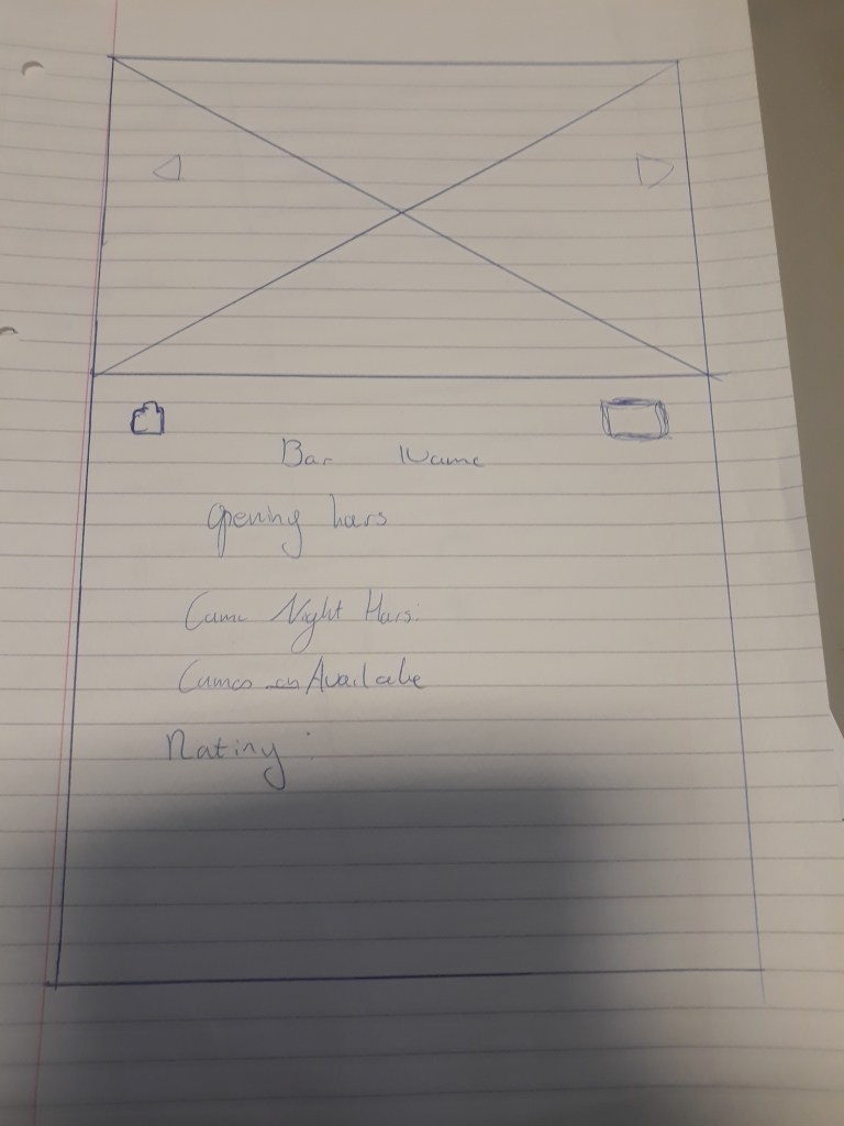
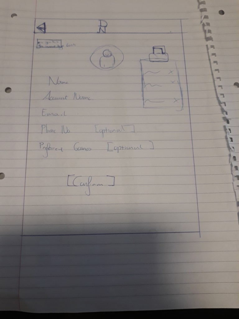
For our second iteration of the design we took some of the feedback given with regards to the inclusion of a larger bar view, and the start of a profile page for users. The idea behind the profile page would be for later integration with more ‘social’ features, such as being able to add friends through the app and organize groups for further nights out. The bar profile would display what games the bar had on offer, what users rated their experience of the bar was and what their opening and closing times were.
Group Iteration
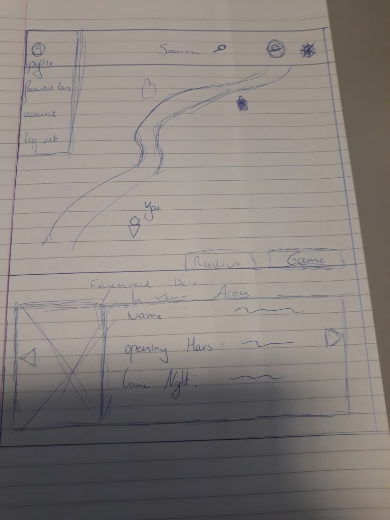
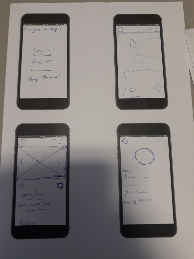
This version featured some more changes we made to some of the pages and overall cleaning up the design of the map, to make it less cluttered. One critical piece of feedback was the presence of items or elements that had little explanation and served only to bloat the design. The featured bars elements were also removed, as users felt that not having the full map available was detrimental to the app’s design.